1328 hand-tested AI prompts across image, video, and music — each with full context, variables, and a sample output. Content is authored in Traditional Chinese; the UI here is English.
PRO01Create a screenshot of an X (Twitter) post in dark mode, from the blue-verified @OpenAI account. The Chinese tweet text reads: 'Today I'd like to recommend a great AI builder: Ailln...'
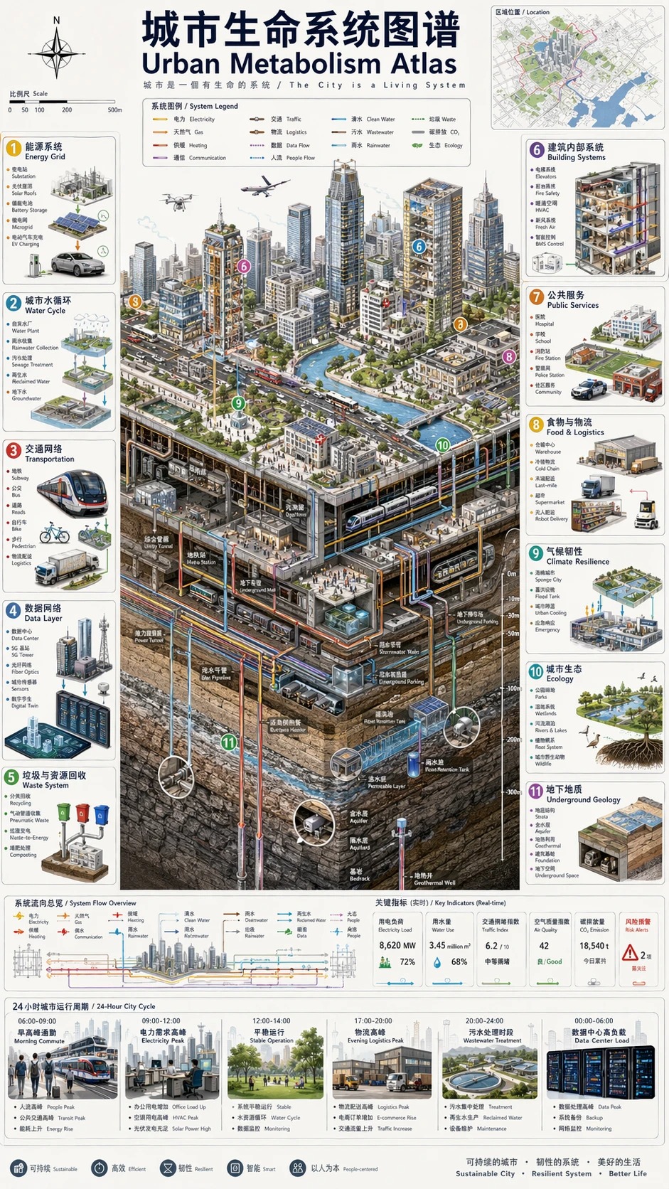
PRO02Vertical 9:16 isometric cutaway infographic "Urban Life-System Atlas / Urban Metabolism…
Does AI always make your skincare look cheap? The problem isn't the bottle, it's everything around it. Wet surface reflection + rim lighting + droplet placement push the clinical-luxury feel to the max.
Not a font, not fantasy calligraphy. It crystallizes a person's psychology, way of thinking, and style into a structured symbolic language, a powerhouse for branding, personal branding, and concept art.
The 'quote card' format that goes viral on IG — layout-led, minimal background, Chinese and English text coexisting without clashing. Ideogram is currently the only model that renders Chinese and English text together reliably.
Element counts are pinned down exactly (seven pairs of dot-work, two fern leaves), whitespace is written in metric units (at least 8mm between each element), and the finished size is also written in...
`Change only the rendering` cleanly separates 'what to change' from 'what must not change,' and adding...
What makes a composite look fake always comes down to looking 'pasted on' — this line pins down, item by item, that it should compress over muscle bulges, blur slightly at the edges, and pick up the original photo's exposure and...
The key to an infographic is carving out the sections first — quoting each of the three section headers by name in quotation marks keeps the model from blurring text into pure decoration; adding...
Leave 'condensing the information' to the model, but lock down 'which words absolutely must appear' with quotation marks — educational diagrams are most vulnerable to labels going off-script, and this...
Naming `orthographic` along with the three drafting views — plan, elevation, and section — makes the model...
The phrase `deconstructed to show the texture of…` ties an exploded-view diagram together with appetite appeal...
The sketch serves as the layout template, and the model only handles the materials — `Keep the exact layout of…` is...
Clear division of labor — placeholder boxes get 'their content swapped in,' while button positions and the grid are 'not to be touched'; UI mockups are most vulnerable to...
Generate a vertical-format price board for a bubble tea shop or food stall: each item and price locked with full-width quotation marks, character counts noted per line, and safeguards against simplified-character variants. Built for boards headed straight to print. Honest caveat: the more items, the higher the error rate — beyond ten items, split into two generations; for a one- or two-character mistake, just regenerate, or ask the model to fix only the wrong lines.
Generate a step-by-step SOP diagram for staff training in one pass: the title and every step's text locked with full-width quotation marks, character counts noted per step, and step numbers in Arabic numerals to reduce the error surface. Good for follow-the-steps scenarios like opening procedures or cleaning protocols. Limits: keep steps to six or fewer, with roughly ten characters per line for the most stable results; the illustrated action occasionally doesn't match the text — just ask it to redraw that one panel.
Two key priorities for generating event tickets and staff passes: locking the event name and date in quotation marks (with character-count declarations and safeguards for characters like '證/号'), and clearly reserving a pure white blank zone for a serial number or QR code to be added later. It specifically adds a 'no fake barcodes or serial numbers' rule — the model loves to invent a fake barcode on its own initiative, and you don't want to find out it can't be scanned only after printing.
The most painful part of e-commerce lifestyle shots is 'each of the four images looking like it came from a different shoot': generating them in four separate passes almost always shifts the product's appearance and lighting. This approach instead generates a single 2x2 four-panel grid in one pass — since all four panels share the same generation, consistency is far more stable than generating separately. The trade-off must be stated plainly: each panel is only a quarter of the full image's resolution, small text on product labels may come out blurry, and you'll need to upscale or regenerate individual panels when you need a larger image.
Handles the two big requirements for wrapping paper and bag patterns at once: tileability, and staying unobtrusive as a background so a logo doesn't get lost in it. Achieved via low density plus even negative space plus low contrast to leave breathing room for a logo, and by banning directional lighting/shadow and perspective to preserve the tiling. Honest limitation: generative models don't guarantee true seamlessness — check the edge seams in image-editing software using an offset test, patch locally wherever there's a visible seam, and don't expect it to be perfect in one shot.
The old problem with generating recipe step photos separately: the countertop, cookware, and lighting jump around from shot to shot, and readers spot the inconsistency immediately. This approach generates a single grid in one pass to lock consistency, then constrains ingredient state progression with the rule 'each panel must be a plausible continuation of the one before it.' Limitation: the more panels, the smaller each one gets — split into two images past six panels, and the second image needs to repeat the same countertop and lighting setup to connect properly.
Generate a lively hero storefront image for night market and street-food vendors: warm yellow string lights, sign text accurate character by character in Traditional Chinese, and a blurred crowd of customers queuing in the background — ready to post straight to a Google Business Profile, delivery-platform header, or Facebook page cover.
Upgrade a casual phone photo of a secondhand bag, watch, or sneaker into a studio-quality listing image: swap in a clean background and professional lighting, while honestly preserving every scratch and sign of wear — better presentation without risking a condition dispute after delivery.
Generates sports-brand-ad-level coach portraits for independent trainers and small gyms: a dark gym-equipment backdrop, orange rim lighting outlining muscle definition, and reserved negative space for copy — ready to use directly on recruitment flyers, booking platforms, and Instagram.
Generate a lavish key visual for a Ghost Festival (Zhongyuan Pudu) sale: a pyramid-style stack of offerings, warm candlelight, and promotional slogans and dates rendered accurately without garbled text — ready to use for hypermarkets, corner stores, group-buy organizers, and hang-tags.