FLUX.2 E-Commerce Product Four-Panel Lifestyle Set: Same Product, Four Scenes, Consistent Lighting Tone
The most painful part of e-commerce lifestyle shots is 'each of the four images looking like it came from a different shoot': generating them in four separate passes almost always shifts the product's appearance and lighting. This approach instead generates a single 2x2 four-panel grid in one pass — since all four panels share the same generation, consistency is far more stable than generating separately. The trade-off must be stated plainly: each panel is only a quarter of the full image's resolution, small text on product labels may come out blurry, and you'll need to upscale or regenerate individual panels when you need a larger image.
【用途】
為電商商品頁生成一張 2×2 四宮格產品情境照、四格是同一件產品在四個不同生活場景、用於商品頁「情境展示」區。四格必須看起來像同一位攝影師、同一天、同一套色調拍出來的。

【產品描述——四格都必須完全一致】
[產品名稱與外觀描述]
四格中的產品外觀、顏色、材質、比例必須完全相同、不得在任何一格改變產品的細節或配色。

【四個場景】
- 左上:[場景一]
- 右上:[場景二]
- 左下:[場景三]
- 右下:[場景四]
每格產品都是畫面主角、佔畫面約三分之一、場景元素只做陪襯、不搶戲。

【光線與調性——全圖統一】
- 光線:[光線設定]、四格光源方向與軟硬一致
- 色調:[色調與氛圍]、四格套同一組色調、白平衡一致
- 質感:商業產品攝影、85mm 定焦鏡頭視角、淺景深、產品銳利、背景微散景

【版面】
2×2 四宮格、格與格之間用等寬細白色分隔線、四格構圖重心一致(產品都在格內同一相對位置)、整體看起來是一組系列照。圖上不要出現任何文字或浮水印。
Swap the variables inside the [ ] brackets for your own content, then paste into FLUX.2.
No other tool needed — run this prompt right here and see the result (edit the text and swap the [variables] first if you like). History lives in My generations.
'Generating four panels within a single image' is the most practical low-tech trick for pulling off consistency: a model's ability to maintain style and object consistency within one generation pass is far stronger than across four separate ones. The prompt hedges its bets in three places: the product description is written as its own standalone section with an explicit instruction that 'details must not change across the four panels,' the light source direction is fixed, and the compositional focal point is kept consistent. Known limitations: the four-panel grid sacrifices per-panel resolution, small text on product labels tends to blur, so brand text is better added in post; if a product gets distorted in one particular panel, making that panel's scene description more specific and regenerating usually works better than redoing the whole image. If the model struggles with a Chinese-language scene description, switching that scene sentence to English usually gives more stable results.
[產品名稱與外觀描述]例:霧面奶茶色不鏽鋼保溫瓶、瓶身圓柱形、竹木紋瓶蓋、瓶身下緣有一圈細凹槽
[場景一]例:清晨木質書桌、旁邊有攤開的筆記本與咖啡
[場景二]例:健身房長椅上、背景是模糊的健身器材
[場景三]例:野餐墊上、旁邊有水果與草帽、自然光
[場景四]例:辦公室會議桌、筆電旁、窗光側照
[光線設定]例:柔和自然光、光源一律來自左上方
填下面的欄位,上方 prompt 會即時替換 [方括號] 內容。填好後按「複製組好的 prompt」直接丟進工具。
【用途】
為電商商品頁生成一張 2×2 四宮格產品情境照、四格是同一件產品在四個不同生活場景、用於商品頁「情境展示」區。四格必須看起來像同一位攝影師、同一天、同一套色調拍出來的。

【產品描述——四格都必須完全一致】
[產品名稱與外觀描述]
四格中的產品外觀、顏色、材質、比例必須完全相同、不得在任何一格改變產品的細節或配色。

【四個場景】
- 左上:[場景一]
- 右上:[場景二]
- 左下:[場景三]
- 右下:[場景四]
每格產品都是畫面主角、佔畫面約三分之一、場景元素只做陪襯、不搶戲。

【光線與調性——全圖統一】
- 光線:[光線設定]、四格光源方向與軟硬一致
- 色調:[色調與氛圍]、四格套同一組色調、白平衡一致
- 質感:商業產品攝影、85mm 定焦鏡頭視角、淺景深、產品銳利、背景微散景

【版面】
2×2 四宮格、格與格之間用等寬細白色分隔線、四格構圖重心一致(產品都在格內同一相對位置)、整體看起來是一組系列照。圖上不要出現任何文字或浮水印。
 PRO01
PRO01Premium 3D Collectible Figure Avatar
Transform the input photo into a high-end stylized 3D collectible figure…
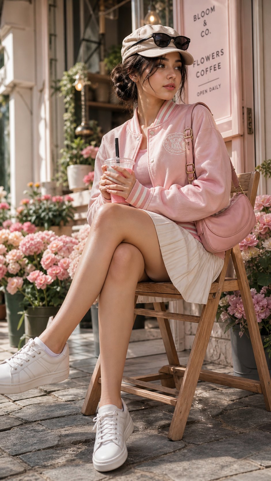 PRO02
PRO02Cherry Blossom Café Outdoor Portrait
Edit the provided image while preserving the same face identity, shape,…
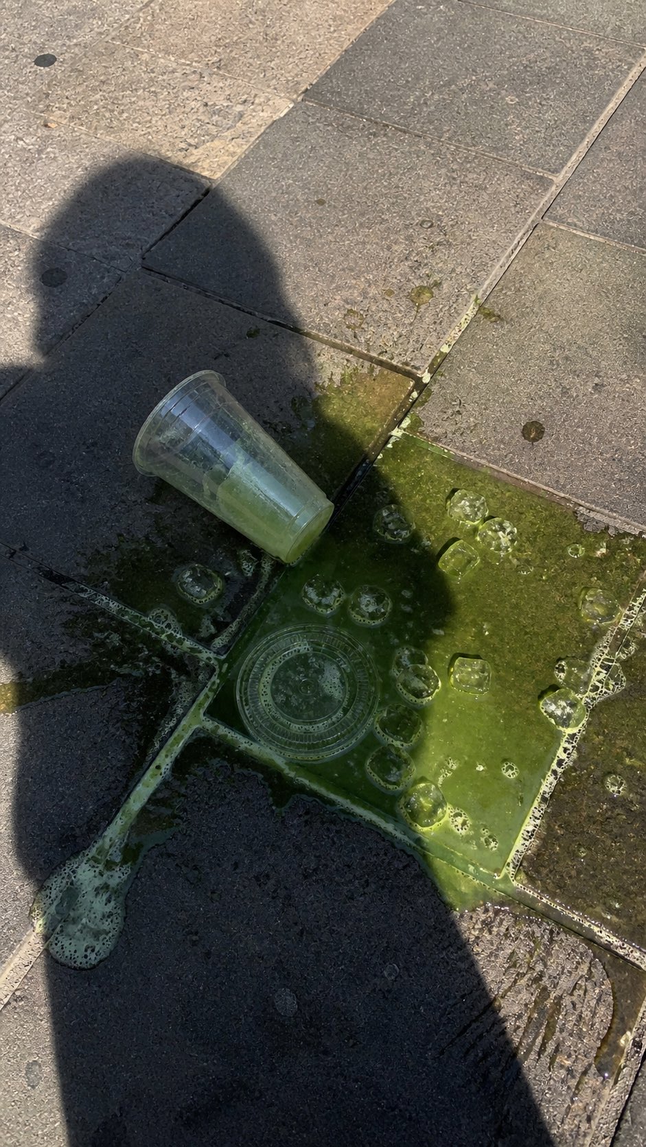 PRO03
PRO03Spilled Matcha Street Smartphone Photo
A realistic vertical smartphone photo of a spilled green iced drink on o…
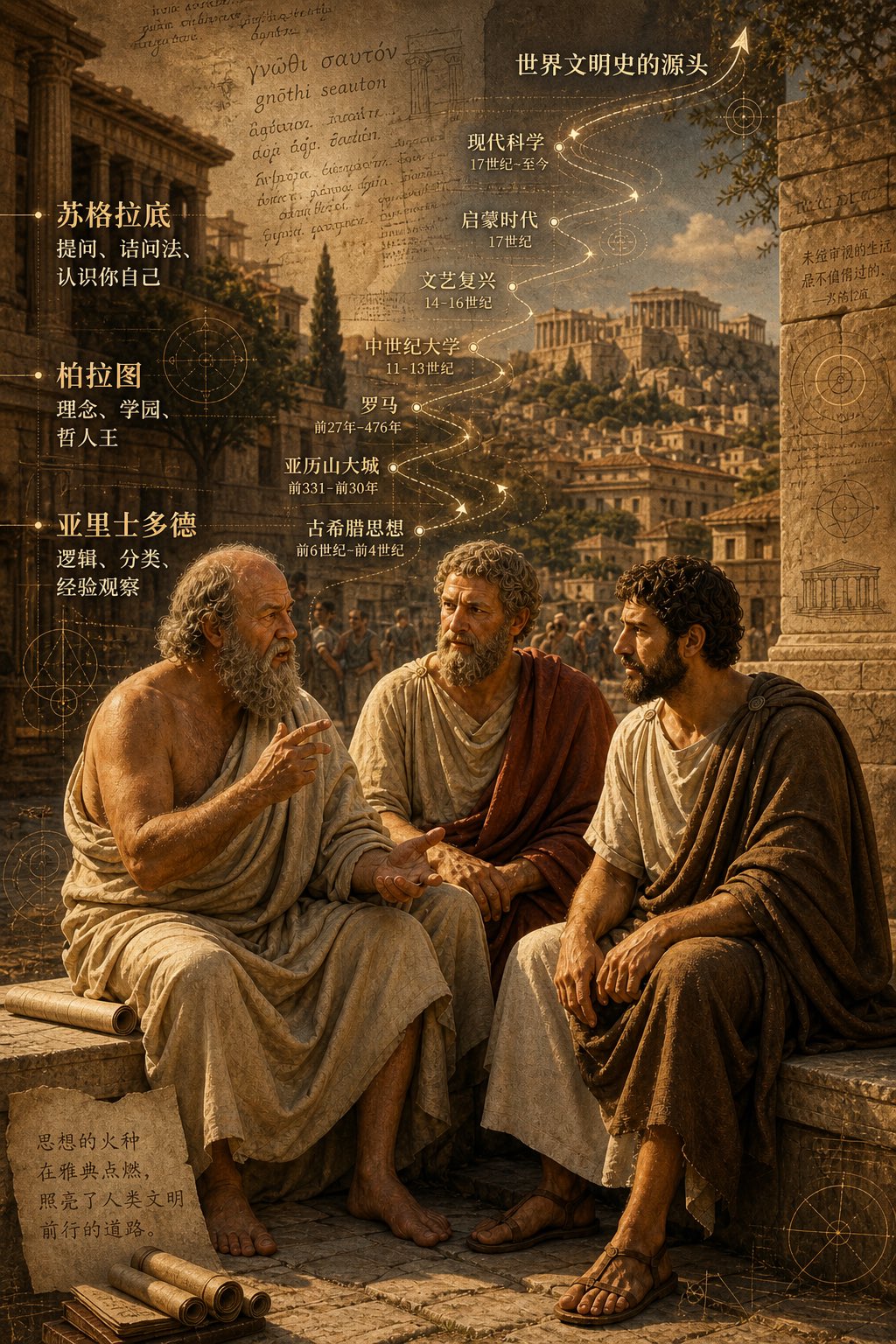 PRO04
PRO04Three Ancient Greek Philosophers Timeline City Map
Two and a half thousand years ago, Plato, Socrates, and Aristotle sat talking on the streets of Athens, and that conversation gave rise to the origins of world civilization. In the background, their conversation can be added, following the timeline, overlaid onto ancient Gree…