Night Market Stall Sign: Vertical Menu with Taiwanese Neon Lettering
A signboard for a Taiwanese night market food stall, with a vertical-text menu, prices, and bold hand-lettered type — unmistakably Taiwanese with no garbled characters.
【用途】設計一張台灣夜市攤車的正面看板,[攤位類型],要有招牌大字 + 直書菜單 + 價格,風格 [風格關鍵字],尺寸 [尺寸比例]。

【圖上文字|全部繁體中文、與引號內逐字一致,不增不減、不簡體】
- 攤名招牌大字:「[攤名]」
- 一句招攬標語:「[招攬標語]」
- 菜單品項與價格(直書,由右到左排列,每行一品項一價格):
[菜單清單]

【文字層級】
1. 攤名招牌最大、最搶眼,放上方或正中。
2. 招攬標語次之,放招牌附近。
3. 菜單品項與價格清楚對齊、字級一致,價格用台灣常見「NT$」或「元」寫法。

【視覺風格】
- 台灣夜市攤車氛圍:暖黃燈泡、紅底白字或復古鐵皮感、油亮熱炒煙氣。
- [風格關鍵字],台味、親切、熱鬧但文字仍清楚可讀。
- 字體用粗黑體或復古手寫風,繁體中文(台灣寫法),不要日文、不要簡體。

【構圖】
- 攤車正面視角,招牌在上、菜單在下或側欄直書。
- 直書菜單由右到左、由上到下排列,符合台灣傳統看板習慣。
- 文字不貼邊、不被燈泡或裝飾遮住。

【輸出】高解析、文字銳利。生成後自我檢查:直書順序是否正確、每個品項與價格是否與清單逐字相同、有無錯字。
Swap the variables inside the [ ] brackets for your own content, then paste into GPT Image 2.
No other tool needed — run this prompt right here and see the result (edit the text and swap the [variables] first if you like). History lives in My generations.
Use this for signboards for night market stalls, street-food carts, and stir-fry joints. GPT Image 2 excels at precise multi-line text, but vertical menus are a weak point — models trained mostly on English often get the reading order wrong or lay characters on their side, so you must explicitly specify 'vertical text, right to left, top to bottom' and list every menu item as a fixed checklist. Another common pitfall for this scene is the model drifting toward a Japanese yatai or Hong Kong dai pai dong look instead — adding concrete details like 'Taiwanese night market, warm yellow bulbs, red background with white text, corrugated metal stall' pulls it back to the right aesthetic. Prices are easy to get wrong, so keep the numbers few and the format consistent (all in '元' or all in 'NT$'). In practice, vertical text is harder to stabilize than horizontal — if the order comes out scrambled in the first pass, telling it to 'redo the menu as vertical text, right to left, leave everything else unchanged' usually fixes it. This is a design mockup; for an actual physical sign, hand it off to a print shop to fine-tune the typeface.
[攤位類型]賣什麼的攤子。例:鹽酥雞攤、刈包店、古早味豆花攤、現烤香腸
[風格關鍵字]看板的視覺調性。例:復古鐵皮紅底白字、霓虹燈管夜市風、手寫粉筆黑板感
[尺寸比例]看板畫面長寬比。例:橫式招牌用 16:9、直式側欄菜單用 3:4
[攤名]攤子的名字,會做成招牌大字。例:阿勇現炸鹹酥雞
[招攬標語]一句吸引客人的話。例:現點現炸 不夠脆免錢
[菜單清單]逐行列出品項與價格,會直書排列。例:鹹酥雞 60/四季豆 40/甜不辣 40/杏鮑菇 50/加辣加蒜免費
填下面的欄位,上方 prompt 會即時替換 [方括號] 內容。填好後按「複製組好的 prompt」直接丟進工具。
【用途】設計一張台灣夜市攤車的正面看板,[攤位類型],要有招牌大字 + 直書菜單 + 價格,風格 [風格關鍵字],尺寸 [尺寸比例]。

【圖上文字|全部繁體中文、與引號內逐字一致,不增不減、不簡體】
- 攤名招牌大字:「[攤名]」
- 一句招攬標語:「[招攬標語]」
- 菜單品項與價格(直書,由右到左排列,每行一品項一價格):
[菜單清單]

【文字層級】
1. 攤名招牌最大、最搶眼,放上方或正中。
2. 招攬標語次之,放招牌附近。
3. 菜單品項與價格清楚對齊、字級一致,價格用台灣常見「NT$」或「元」寫法。

【視覺風格】
- 台灣夜市攤車氛圍:暖黃燈泡、紅底白字或復古鐵皮感、油亮熱炒煙氣。
- [風格關鍵字],台味、親切、熱鬧但文字仍清楚可讀。
- 字體用粗黑體或復古手寫風,繁體中文(台灣寫法),不要日文、不要簡體。

【構圖】
- 攤車正面視角,招牌在上、菜單在下或側欄直書。
- 直書菜單由右到左、由上到下排列,符合台灣傳統看板習慣。
- 文字不貼邊、不被燈泡或裝飾遮住。

【輸出】高解析、文字銳利。生成後自我檢查:直書順序是否正確、每個品項與價格是否與清單逐字相同、有無錯字。
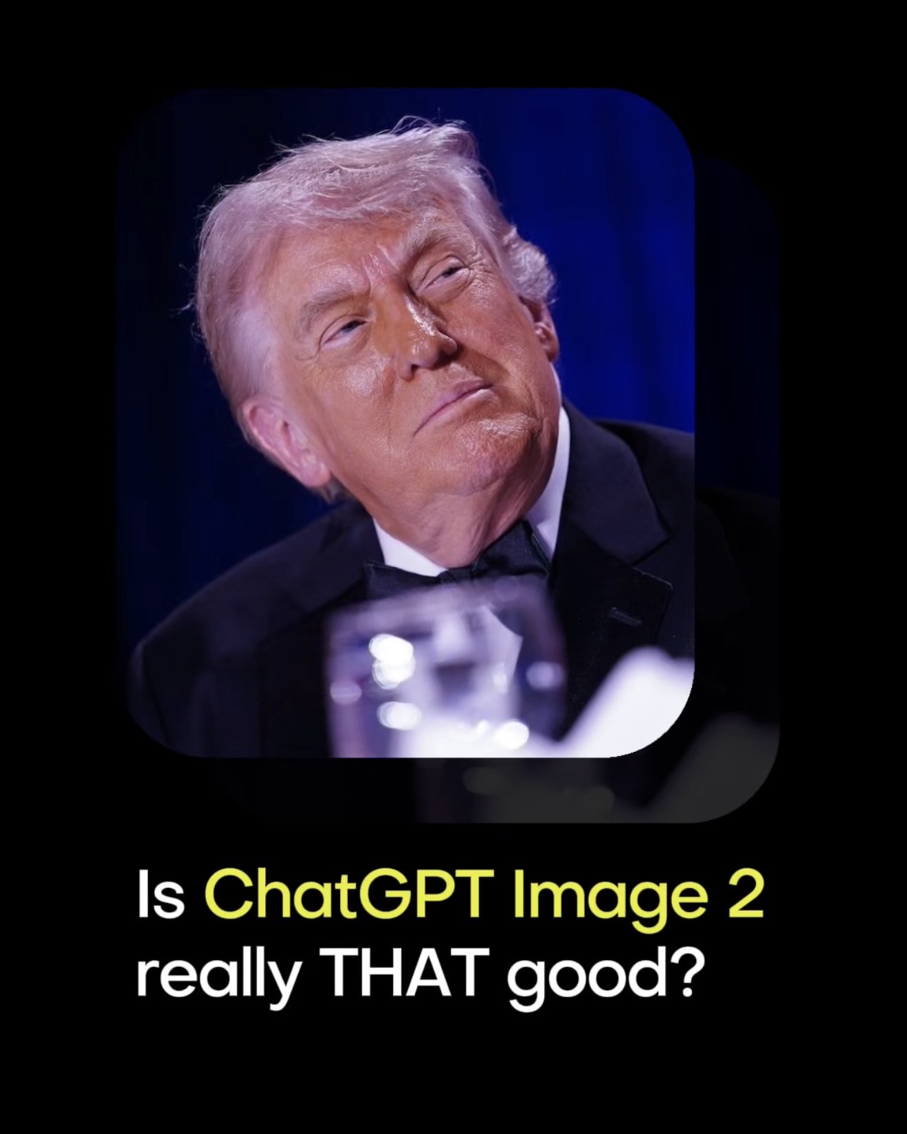 PRO01
PRO01Premium 3D Collectible Figure Avatar
Transform the input photo into a high-end stylized 3D collectible figure…
 PRO02
PRO02Cherry Blossom Café Outdoor Portrait
Edit the provided image while preserving the same face identity, shape,…
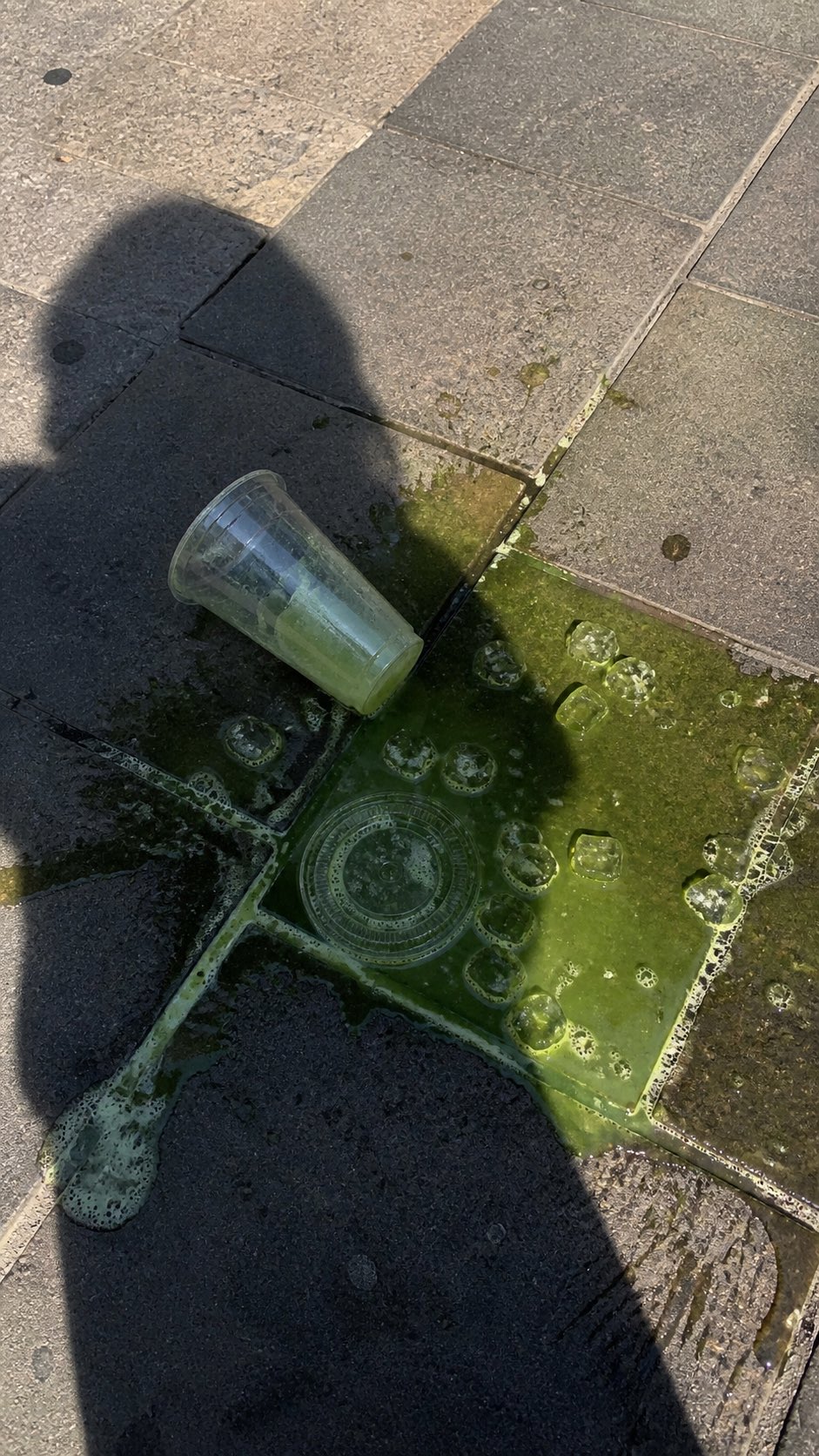 PRO03
PRO03Spilled Matcha Street Smartphone Photo
A realistic vertical smartphone photo of a spilled green iced drink on o…
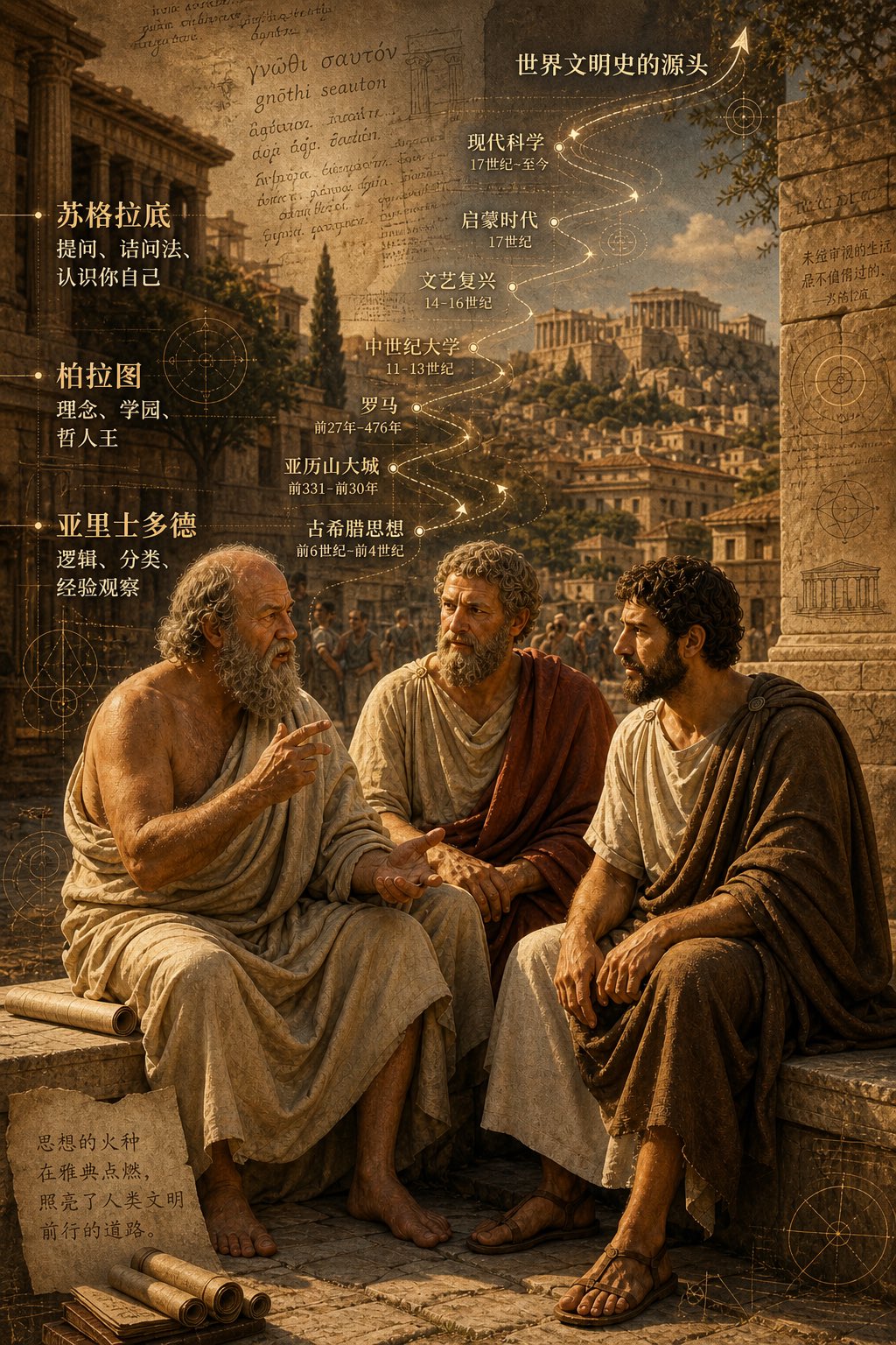 PRO04
PRO04Three Ancient Greek Philosophers Timeline City Map
Two and a half thousand years ago, Plato, Socrates, and Aristotle sat talking on the streets of Athens, and that conversation gave rise to the origins of world civilization. In the background, their conversation can be added, following the timeline, overlaid onto ancient Gree…