PROMPTS
1346 original and curated AI prompts across image, video, music, and tutorials. Browse by tool, use case, and difficulty; each entry shows its available notes and examples.
Filters2 activeExpandCollapse
 PRO01
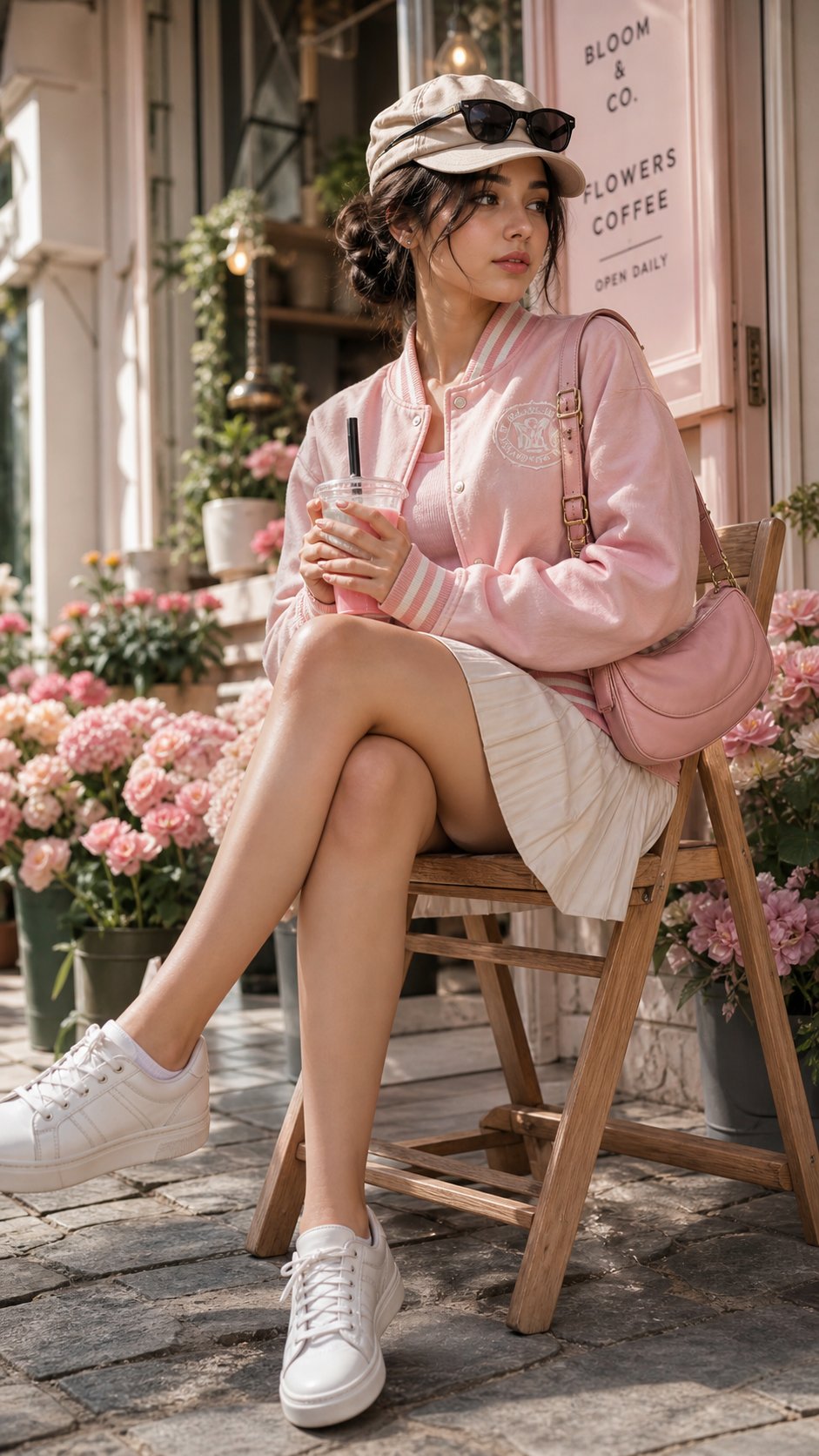
PRO01Cherry Blossom Café Outdoor Portrait
Edit the provided image while preserving the same face identity, shape,…
 PRO02
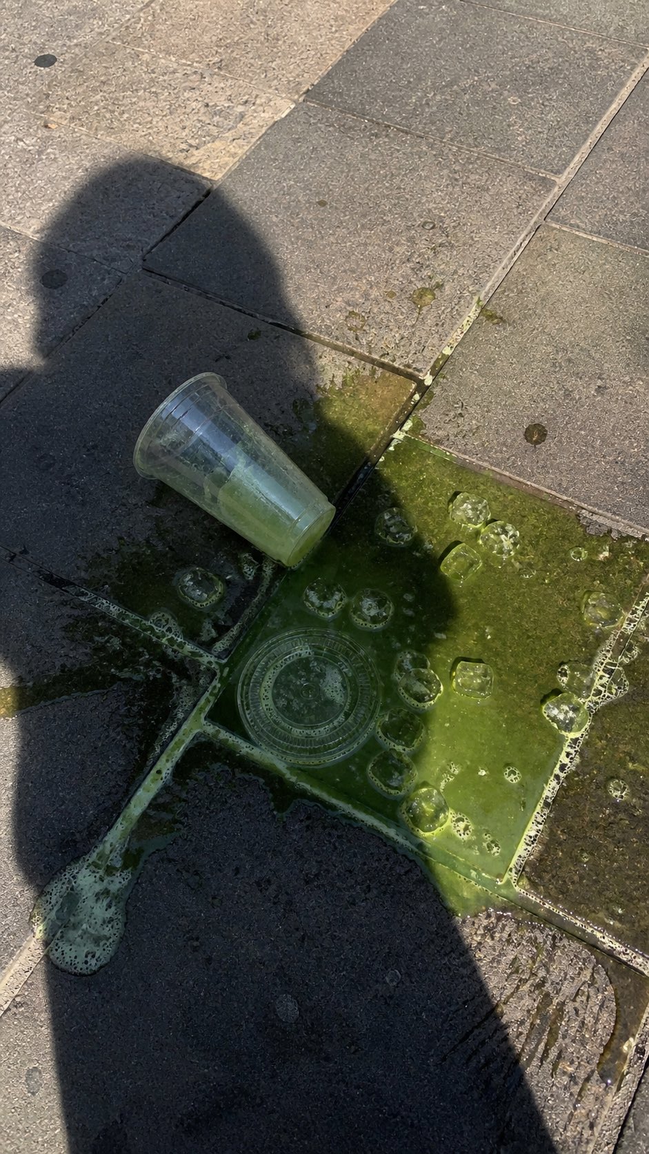
PRO02Spilled Matcha Street Smartphone Photo
A realistic vertical smartphone photo of a spilled green iced drink on o…
 PRO03
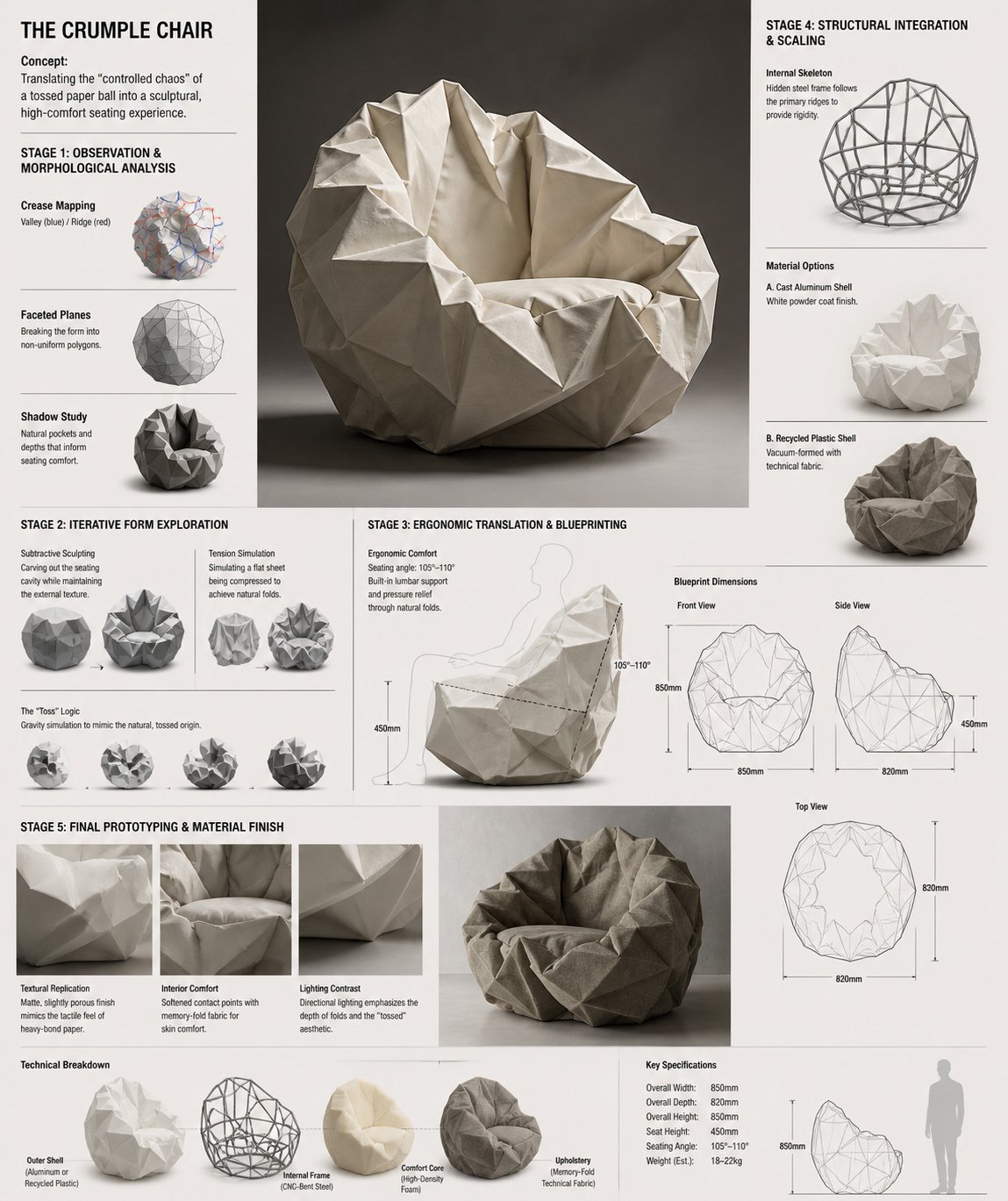
PRO03Crumple Chair Concept Development Board
Design Concept: The Crumple Chair Core Philosophy: Translating the "cont…
 PRO04
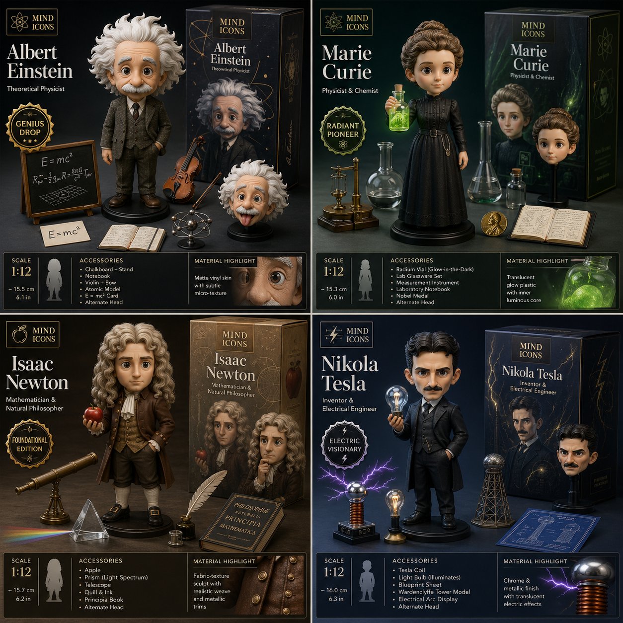
PRO04Historical Scientists Collector Figure Reveal Grid
2x2 grid, do this for 4 famous scientists in history: Design a collector…
 PRO05
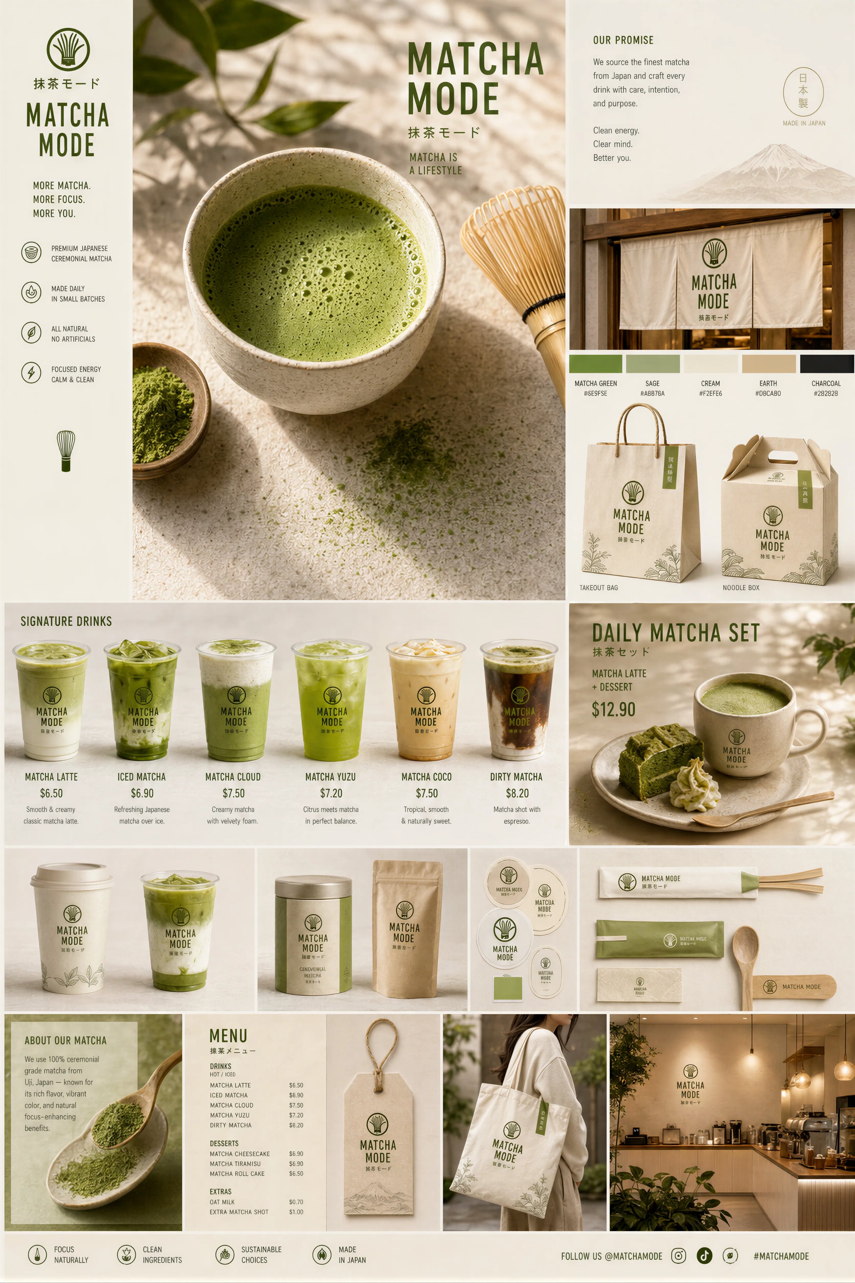
PRO05Matcha Brand Touchpoint System Moodboard
Create a premium "Matcha Brand Touchpoint System" visual board for a mod…
 PRO06
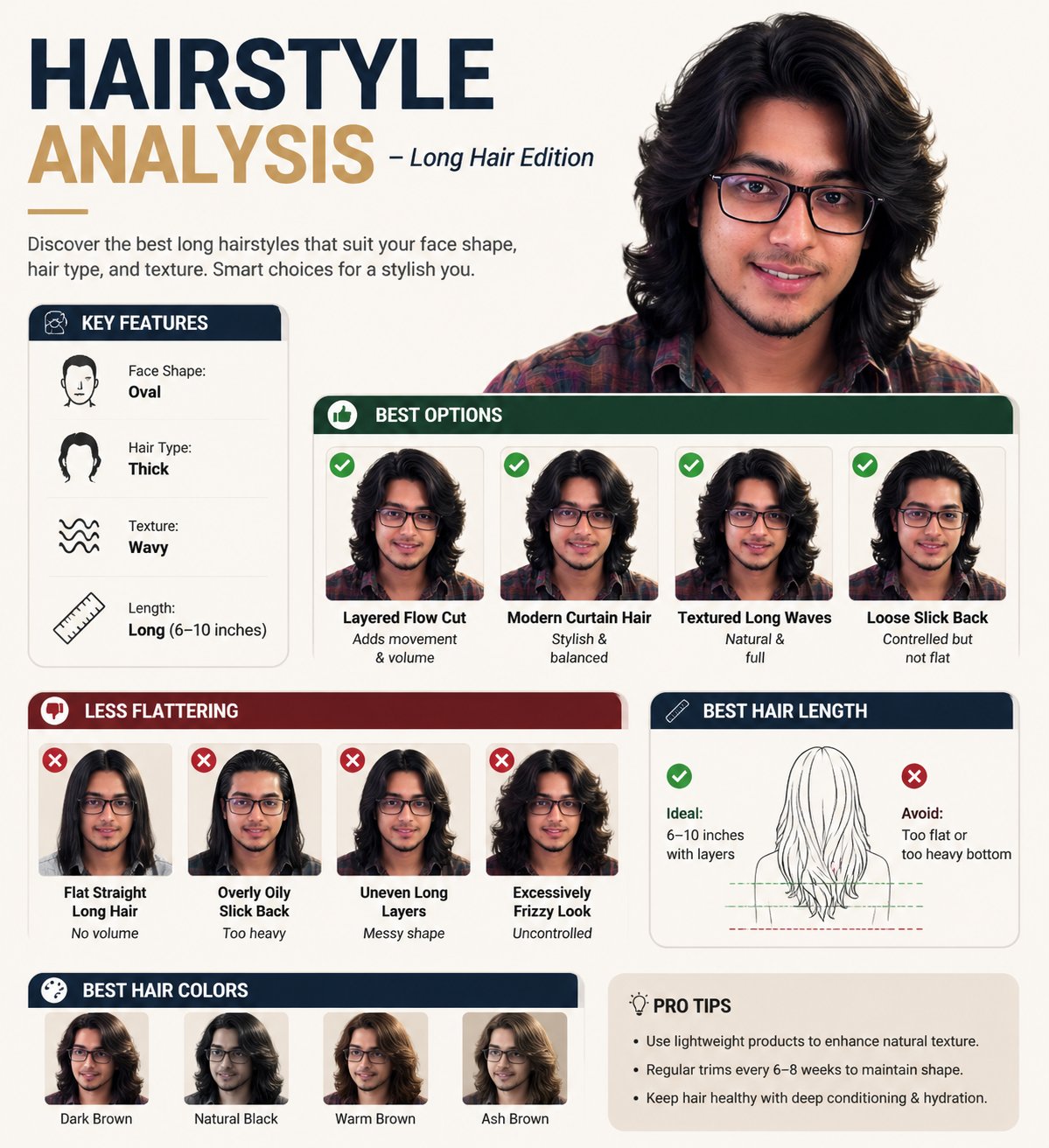
PRO06Long Hairstyle Analysis Infographic
Create a professional "HAIRSTYLE ANALYSIS" infographic with a different…
 PRO07
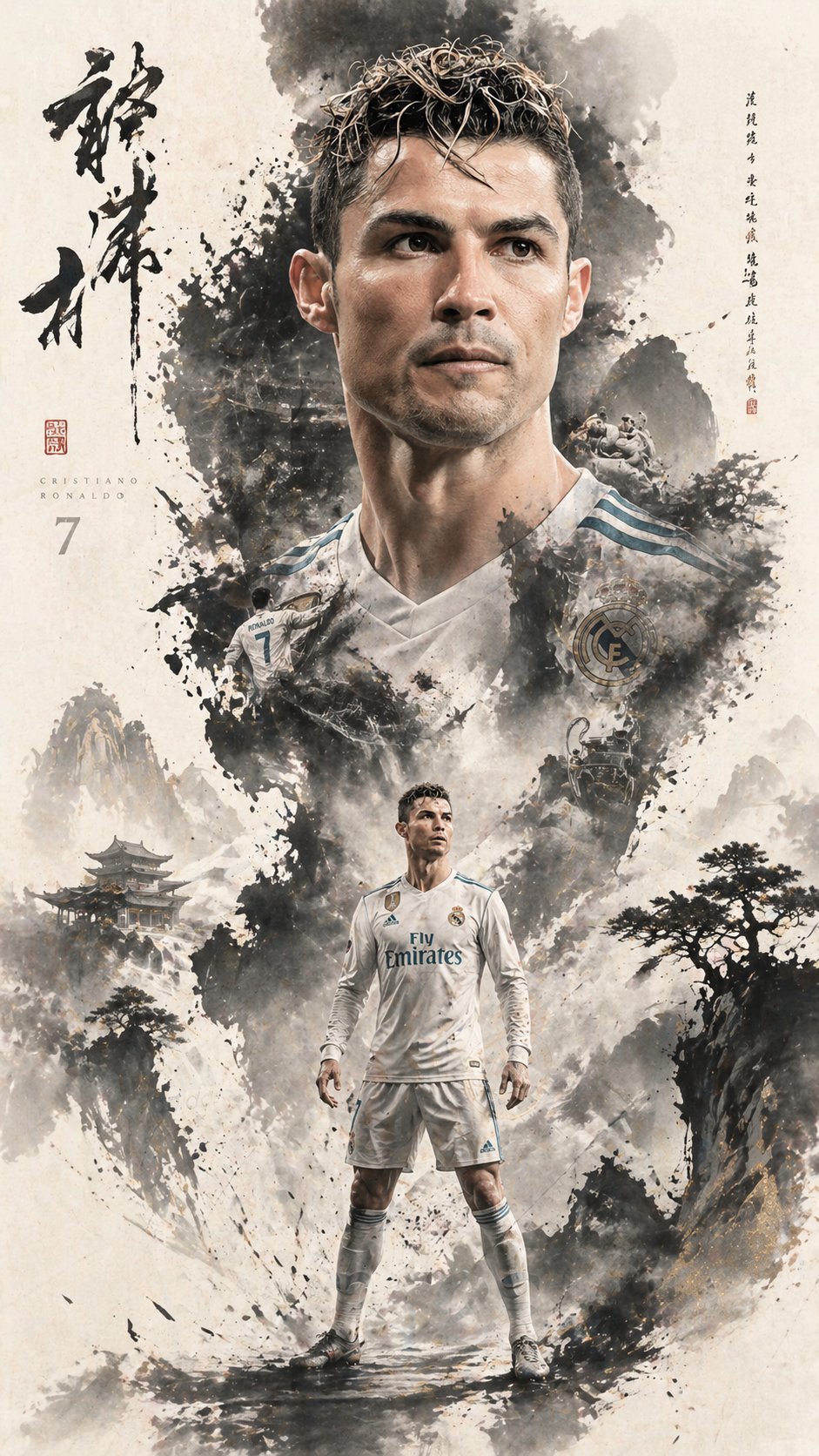
PRO07Ink Wash Double Exposure Character Poster
A cinematic character promotional poster of [SUBJECT], vertical composit…
 PRO08
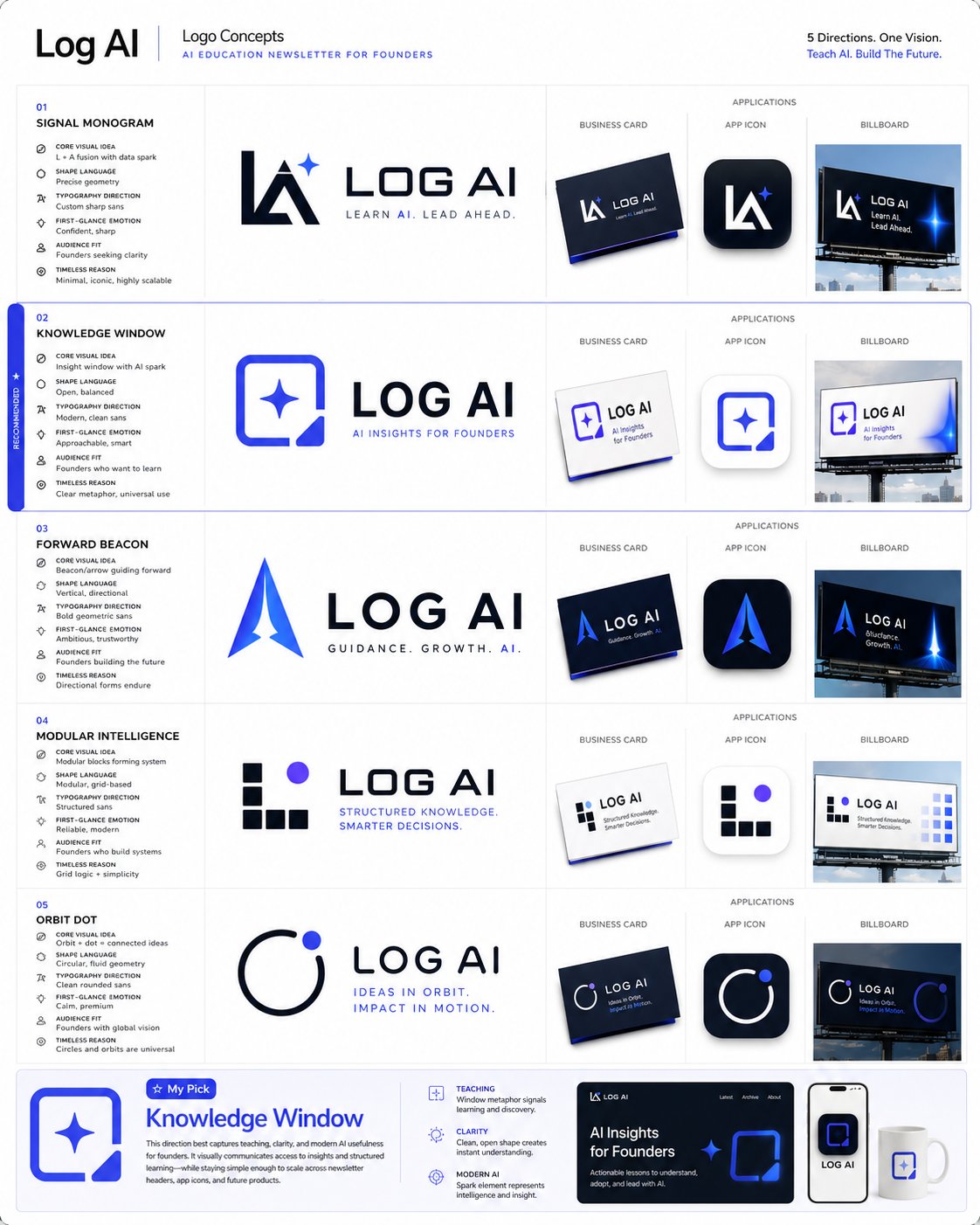
PRO08Logo & Brand Identity System Prompt Collection
1. Logo Concept Generation Prompt: You are a top-tier logo designer with 20 years of experience, having designed instantly recognizable and deeply meaningful logos for globally renowned brands. Brand name: [your brand name…
 PRO09
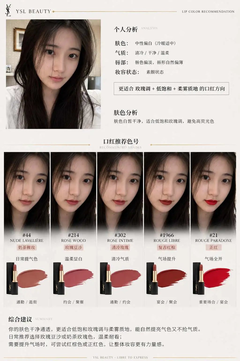
PRO09Brand Lipstick Recommendation Report Infographic
I. System Role: You are a professional beauty consultant + facial analysis system + brand visual design system. Your task: based on the user's uploaded selfie and a specified lipstick brand, generate an infographic with brand-consistent tone…
 PRO10
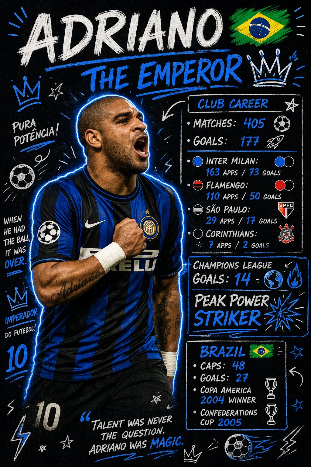
PRO10Football Player Stats Doodle Poster
Create a scrapbook doodle-style football poster of [PLAYER_NAME]. AI aut…
 PRO11
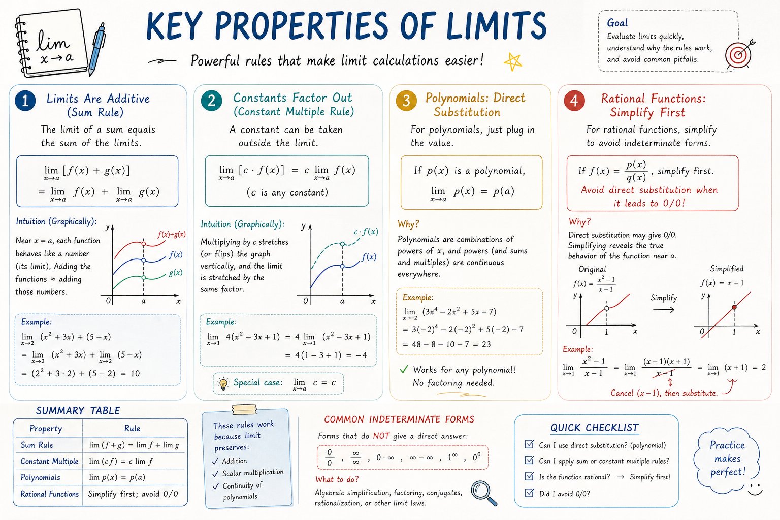
PRO11AP Calculus Study Sheet Infographic
Please create a mathematical visualization infographic about "[math concept]"…
 PRO12
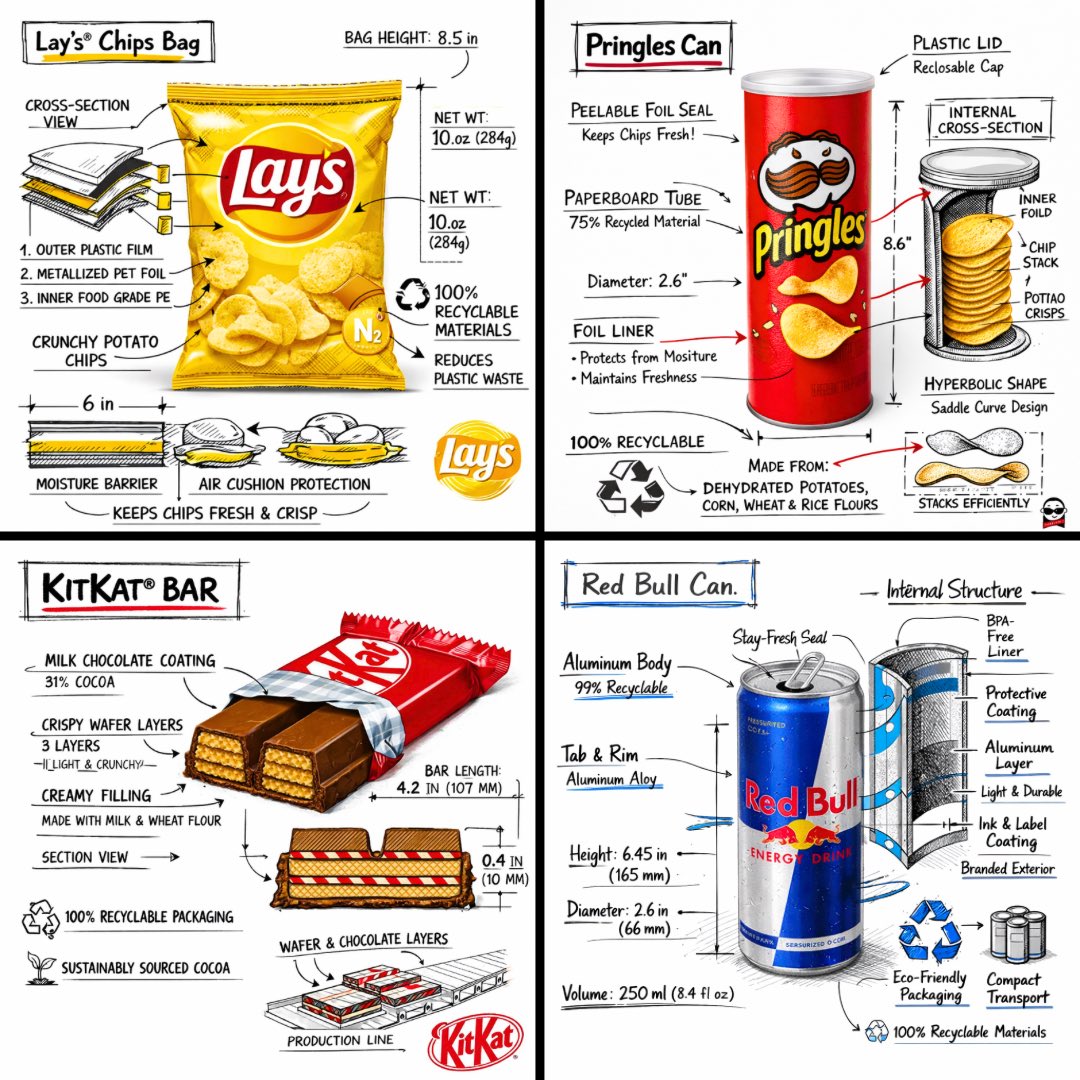
PRO12Snack Brand Technical Breakdown Infographic
Create a branded technical infographic for [SNACK], combining a real photo or photorealistic render of the product with technical annotation overlays placed directly on top, against a pure white studio background, using...
 PRO13
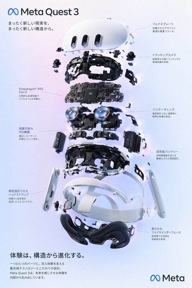
PRO13Interactive UI Design Visual
{ "type": "exploded view product diagram poster", "subject": "VR headse…
GPT Image: translate your identity into a personal alphabet system
Not a font, not fantasy calligraphy. It crystallizes a person's psychology, way of thinking, and style into a structured symbolic language, a powerhouse for branding, personal branding, and concept art.
A glass product hero with separate product and set references
Assign distinct roles to product and set references for a glass product hero.
Food editorial photography with a clear visual hierarchy
Build a menu hero around food texture, restrained props and space for type.
A packaging type proof with a short title and frontal view
A short label, simple hierarchy and frontal view for a packaging concept proof.
Three products with one viewpoint, baseline and lighting setup
Arrange a product family for comparison, checking identity before styling.
Tattoo Flash Sheet Final Art, Symmetrical Line Work
Element counts are pinned down exactly (seven pairs of dot-work, two fern leaves), whitespace is written in metric units (at least 8mm between each element), and the finished size is also written in...
Tattoo-on-Skin Preview, Wrapped to the Spine's Curve
What makes a composite look fake always comes down to looking 'pasted on' — this line pins down, item by item, that it should compress over muscle bulges, blur slightly at the edges, and pick up the original photo's exposure and...
FLUX.2 Brand Seamless Pattern / Wrapping Paper Design: Tileable, With Breathing Room for a Logo
Handles the two big requirements for wrapping paper and bag patterns at once: tileability, and staying unobtrusive as a background so a logo doesn't get lost in it. Achieved via low density plus even negative space plus low contrast to leave breathing room for a logo, and by banning directional lighting/shadow and perspective to preserve the tiling. Honest limitation: generative models don't guarantee true seamlessness — check the edge seams in image-editing software using an offset test, patch locally wherever there's a visible seam, and don't expect it to be perfect in one shot.
Ghost Festival Sale Key Visual: Offering Display, Error-Free Promo Text
Generate a lavish key visual for a Ghost Festival (Zhongyuan Pudu) sale: a pyramid-style stack of offerings, warm candlelight, and promotional slogans and dates rendered accurately without garbled text — ready to use for hypermarkets, corner stores, group-buy organizers, and hang-tags.
Livestream Three-Screen Set: Countdown, Be Right Back, and Outro in One Visual Style
Generate three OBS stream scenes in one go — starting-soon countdown, be-right-back, and stream-ending outro — sharing the same layout and color scheme with only the status text changing, with space reserved for the webcam and chat overlay, so your channel has one consistent brand look from stream start to sign-off.
GPT Image 2: Brand Mascot Character Sheet (Multiple Expressions)
Generates a complete brand mascot character sheet in one shot with GPT Image 2 — the same character shown in multiple expressions and poses, side by side, in a consistent, reusable style, suited to small businesses making LINE stickers, customer-service avatars, or packaging identity.