SaaS Pricing Page Mockup: 3-Column Plan Cards with a 'Recommended' Badge
A three-column subscription pricing page mockup with plan cards whose prices, feature lists, and CTAs are all consistently aligned, and the middle column carrying a 'Most Popular' recommended badge.
【用途】產出一張 SaaS 訂閱方案(pricing)頁的高保真設計稿(design mockup),產品 [產品主題],風格 [設計風格]。

【版面骨架|先定三欄再填內容】
- 頂部:置中區段標題「[區段標題]」+ 一行副標 + 一個「月繳/年繳」切換開關。
- 中段:三張等高方案卡橫排並列,由左到右為入門 → 進階 → 旗艦。
  - 每張卡結構一致:方案名 → 大字價格 → 一句說明 → 功能清單(打勾項)→ 一顆 CTA 按鈕。
  - 中間那張掛「[推薦標籤]」推薦標籤、略放大或高亮。

[ Log in to see the full prompt ]Sign up free to see the full prompt, copy it, save it, and join the discussion. Free content unlocks on login; Pro content is a separate subscription.
Use this when you need to quickly visualize a pricing page layout for a pitch or to align a team on how plans should be structured and which one to push — good for SaaS, membership services, and online courses. The design priorities for a pricing page are alignment and guidance: the three cards need equal height and width, feature lists must line up horizontally, and the recommended middle card needs to stand out most to draw the eye — all of this has to be spelled out explicitly in the prompt, or GPT Image 2 will render three cards of mismatched heights with misaligned features. Three practical reminders: first, fix the layout at three columns and state 'do not change the number of plans yourself' to avoid it generating four or two; second, keep each card's feature list to 4-6 items — more than that and the text gets cramped and starts to error out, while also making alignment harder; third, keep the price format consistent (e.g., always 'NT$/month') and emphasize 'not a real price, layout illustration only' — this is a design mockup, not a live checkout page. Rising/falling color coding doesn't apply here, but 'highlight the recommended card in the primary brand color' is essential, or all three cards will look the same and lose their guiding effect. If the first pass is missing the recommended badge or the cards aren't aligned, telling it to 'add a recommended badge to the middle card and highlight it in the primary color, align the feature lists across all three cards, leave everything else unchanged' should fix it in a regeneration.
 PRO01
Premium 3D Collectible Figure Avatar
Transform the input photo into a high-end stylized 3D collectible figure…
 PRO02
Cherry Blossom Café Outdoor Portrait
Edit the provided image while preserving the same face identity, shape,…
 PRO03
Spilled Matcha Street Smartphone Photo
A realistic vertical smartphone photo of a spilled green iced drink on o…
 PRO04
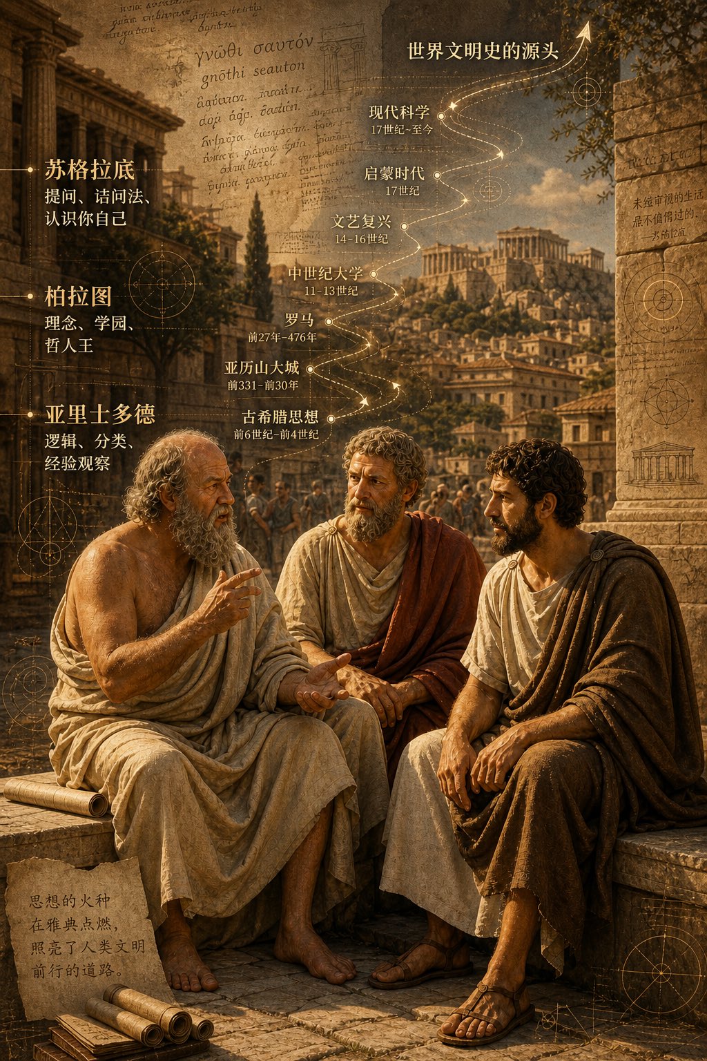
Three Ancient Greek Philosophers Timeline City Map
Two and a half thousand years ago, Plato, Socrates, and Aristotle sat talking on the streets of Athens, and that conversation gave rise to the origins of world civilization. In the background, their conversation can be added, following the timeline, overlaid onto ancient Gree…