Turn Long Text into a Traditional Chinese Knowledge Card
Breaks a piece of content into N key points, laid out as a Traditional Chinese infographic card with a title, bullet points, and labels, all rendered correctly.
【用途】把以下內容做成一張「一張圖看懂」的繁體中文資訊圖卡,給 [平台] 分享用,尺寸 [尺寸比例]。

【先列重點,再排版|不要自己改寫文字】
主題:[主題]
要呈現的重點(共 [重點數量] 點,每點一句話、不超過 20 字):
[重點清單]

【版面結構】
- 頂部:標題列,放主題大字 +一行副標,下方一條細分隔線。
- 中段:[重點數量] 個重點卡片,等距排列、視覺權重一致,每張卡片左側配一個簡單的線性圖示、右側放對應重點文字(與我給的逐字相同)。
- 底部:放一行小字標籤列,例如品牌名或帳號。

【圖上文字|全部繁體中文、與我提供的逐字一致】
- 標題:「[主題]」
- 每張卡片文字:依「重點清單」逐字填入,順序不變、不增不減。

【視覺風格】
- 配色 [配色],整體乾淨、商務感,留白充足不擁擠。
- 字級分三層:標題最大、重點文字中等、標籤最小,層級一眼可分。
- 字體用清晰黑體;橫排書寫;標點用全形中文標點。
- 圖示風格統一(同一套線條粗細與圓角),不要寫實照片、不要花俏裝飾。

【構圖】
- 重點卡片對齊整齊(格線排版),間距一致。
- 文字不貼邊、不重疊,每個區塊之間有清楚呼吸感。

【輸出】高解析、文字銳利可讀。生成後自我檢查:重點數量是否正確、每句文字是否與清單逐字相同、有無錯字或多字。
Swap the variables inside the [ ] brackets for your own content, then paste into GPT Image 2.
No other tool needed — run this prompt right here and see the result (edit the text and swap the [variables] first if you like). History lives in My generations.
Use this to condense a PDF, a long article, or meeting notes into a quick-reference summary card — especially useful for Taiwanese teachers, knowledge-based content creators, and anyone doing a sales presentation. Infographics depend heavily on text precision and are one of the easiest formats to get wrong, so the key move is to list out the key points clearly yourself before asking for the layout — if you just dump a whole article and ask it to 'turn this into a card,' the model will extract and rewrite the points on its own, often missing some or introducing typos. So decide the number of points yourself in advance, write each one as a fixed single sentence, and specify the number of columns, the color scheme, and the three-tier type hierarchy. In practice, 4–6 points is the sweet spot — beyond 8, the text starts shrinking and errors creep in. Also explicitly specify 'horizontal layout, full-width punctuation,' since Chinese punctuation occasionally comes out half-width or vertical otherwise. After generating, always count the points to make sure the number is correct — it occasionally generates one too many or too few — just tell it 'add point N, leave everything else unchanged' to fix it.
[平台]這張圖要發在哪。例:Instagram 貼文、Threads、小紅書、簡報內頁
[尺寸比例]畫面長寬比。例:IG 貼文用 4:5、簡報內頁用 16:9、小紅書用 3:4
[主題]這張圖卡的標題/核心題目。例:新手存錢的 5 個關鍵習慣
[重點數量]要呈現幾個重點,建議 4-6 個最穩。例:5
[重點清單]逐條列出每個重點,一行一句、每句 20 字內。例:1. 先付給自己/2. 設定自動轉帳/3. 記帳只記大項/4. 緊急金存滿三個月/5. 別碰高利貸
[配色]填下面的欄位,上方 prompt 會即時替換 [方括號] 內容。填好後按「複製組好的 prompt」直接丟進工具。
【用途】把以下內容做成一張「一張圖看懂」的繁體中文資訊圖卡,給 [平台] 分享用,尺寸 [尺寸比例]。

【先列重點,再排版|不要自己改寫文字】
主題:[主題]
要呈現的重點(共 [重點數量] 點,每點一句話、不超過 20 字):
[重點清單]

【版面結構】
- 頂部:標題列,放主題大字 +一行副標,下方一條細分隔線。
- 中段:[重點數量] 個重點卡片,等距排列、視覺權重一致,每張卡片左側配一個簡單的線性圖示、右側放對應重點文字(與我給的逐字相同)。
- 底部:放一行小字標籤列,例如品牌名或帳號。

【圖上文字|全部繁體中文、與我提供的逐字一致】
- 標題:「[主題]」
- 每張卡片文字:依「重點清單」逐字填入,順序不變、不增不減。

【視覺風格】
- 配色 [配色],整體乾淨、商務感,留白充足不擁擠。
- 字級分三層:標題最大、重點文字中等、標籤最小,層級一眼可分。
- 字體用清晰黑體;橫排書寫;標點用全形中文標點。
- 圖示風格統一(同一套線條粗細與圓角),不要寫實照片、不要花俏裝飾。

【構圖】
- 重點卡片對齊整齊(格線排版),間距一致。
- 文字不貼邊、不重疊,每個區塊之間有清楚呼吸感。

【輸出】高解析、文字銳利可讀。生成後自我檢查:重點數量是否正確、每句文字是否與清單逐字相同、有無錯字或多字。
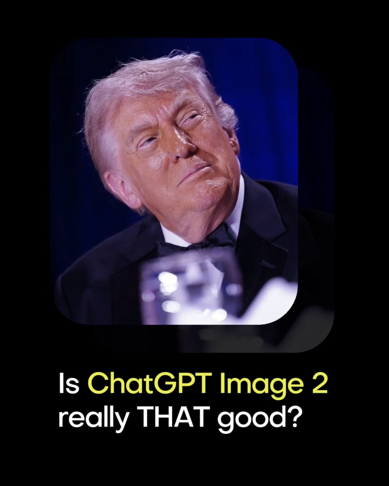 PRO01
PRO01Premium 3D Collectible Figure Avatar
Transform the input photo into a high-end stylized 3D collectible figure…
 PRO02
PRO02Cherry Blossom Café Outdoor Portrait
Edit the provided image while preserving the same face identity, shape,…
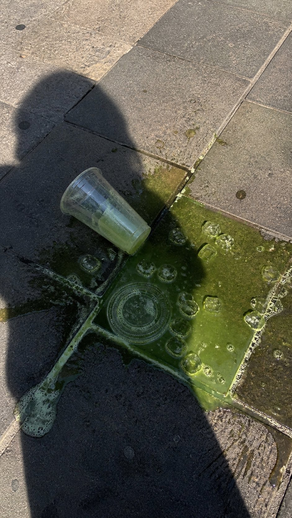 PRO03
PRO03Spilled Matcha Street Smartphone Photo
A realistic vertical smartphone photo of a spilled green iced drink on o…
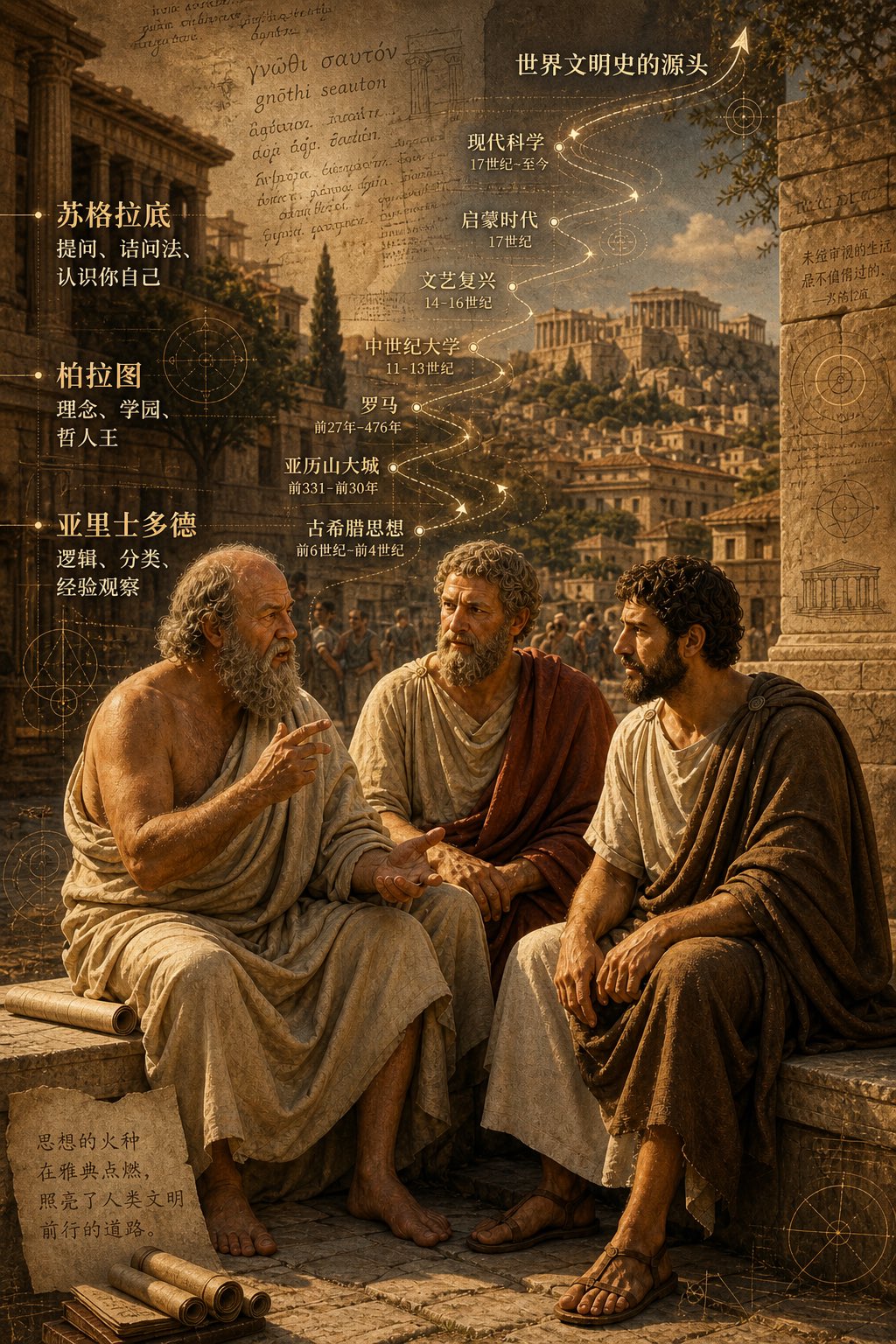 PRO04
PRO04Three Ancient Greek Philosophers Timeline City Map
Two and a half thousand years ago, Plato, Socrates, and Aristotle sat talking on the streets of Athens, and that conversation gave rise to the origins of world civilization. In the background, their conversation can be added, following the timeline, overlaid onto ancient Gree…